Introduction
youplot-rs is a Rust reimplementation of YouPlot, a command-line tool that draws plots on the terminal using Unicode characters. It reads delimiter-separated data from standard input and renders bar charts, histograms, line plots, scatter plots, density plots, box-and-whisker plots, and occurrence tallies directly in your terminal, using nothing more than Unicode block elements, braille patterns, and box-drawing characters.
The Ruby original wraps the unicode_plot.rb library and provides a simple pipe-oriented CLI. youplot-rs preserves that same CLI surface so that existing shell workflows continue to work, while providing the performance and deployment benefits of a statically-linked Rust binary with no runtime dependencies.
Why a rewrite?
YouPlot’s value proposition is its position in shell pipelines. You pipe data into it and get a plot on your terminal in the same breath as awk, cut, or jq. A tool that lives at that layer benefits from being a single static binary that starts instantly and runs anywhere without a Ruby runtime. Rust gives us that, along with stronger correctness guarantees through the type system and the ability to publish the rendering engine as a reusable library crate. This last point was actually the inpetus for the port–having YouCode and UnicodePlots in Rust means we can use it, for example, in Ratatui terminal user interfaces.
Crate architecture
The workspace is organized into three crates that separate concerns cleanly:
unicode-plot is a standalone Unicode terminal plotting library. It provides five canvas types (braille, block, ASCII, dot, and density), a plot layout and annotation system, border decoration, and both plain-text and ANSI color output. This crate is designed to be used independently in any Rust project, whether that is a TUI application built with ratatui, a logging library, or another CLI tool entirely. It has no dependency on the youplot CLI or DSV parsing layer.
youplot is the domain library that bridges tabular input and the plotting library. It handles CSV/TSV parsing with configurable delimiters, data format interpretation (single-series versus multi-series, XY versus YX ordering, XYY versus XYXY pairing), value counting for occurrence tallies, and command dispatch that routes parsed data into the appropriate unicode-plot constructor. This crate encapsulates the business logic that the CLI depends on, and can also be used as a library by other tools that want youplot-style data-to-plot translation without the CLI layer.
youplot-cli is a thin wrapper that handles argument parsing with clap, reads input from stdin with optional encoding conversion, and routes rendered output to stderr, stdout, or a file. It produces the uplot binary. The CLI layer contains essentially no business logic; it translates command-line arguments into domain types and delegates everything else to the youplot and unicode-plot crates.
Feature coverage
youplot-rs supports the same commands and options as the Ruby original: bar charts, histograms, line plots (single and multi-series), scatter plots, density plots, box plots, occurrence counting, and a colors reference display. The unicode-plot library additionally provides staircase plot constructors for use from Rust code. All five canvas types, four border styles, ANSI color output with auto-detection, transpose and header modes for input parsing, output routing flags, and encoding conversion for non-UTF-8 input files are supported.
The features that remain unimplemented are progressive/streaming mode, configuration file loading, and date-axis support. These are documented in the feature comparison table in the project README.
Installation
From source
youplot-rs requires Rust 1.85 or later. Clone the repository and install the uplot binary with cargo:
git clone https://github.com/nrminor/youplot-rs.git
cd youplot-rs
cargo install --path youplot-cli
This places the uplot binary in your cargo bin directory (typically ~/.cargo/bin), which should already be on your PATH if you installed Rust through rustup.
To build without installing system-wide, use cargo build --release from the workspace root. The binary will be at target/release/uplot.
From crates.io
Once the crates are published, installation will be a single command:
cargo install youplot-cli
This is not yet available during the initial development phase.
Verifying the installation
After installing, verify that uplot is available:
uplot --help
You should see the help text listing all available commands and global options.
Platform notes
youplot-rs works on Linux, macOS, and Windows. Terminal rendering quality depends on your terminal emulator’s Unicode support and font coverage.
For the best results, use a terminal emulator and font combination that supports Unicode braille patterns (U+2800 through U+28FF), block elements (U+2580 through U+259F), and box-drawing characters (U+2500 through U+257F). Most modern terminals and monospace fonts handle these well. If braille dots appear as empty boxes or question marks, your font does not include braille glyphs; switching to a font like Noto Sans Mono, DejaVu Sans Mono, or Iosevka will usually resolve this.
Color output is auto-detected based on whether the output stream is a terminal. When piping output through another program or redirecting to a file, colors are automatically suppressed. You can override this behavior with the -C flag to force colors on or the -M flag to force plain output.
Quick Start
This chapter walks through your first pipe-to-plot workflow. By the end you will have gone from raw tabular data to a rendered terminal plot in a single command.
Your first plot
The simplest way to use uplot is to pipe tab-separated data into it. Create a small dataset and draw a bar chart:
printf "Ruby\t65\nPython\t85\nRust\t90\nGo\t70\nJava\t60\n" | uplot bar -t Languages
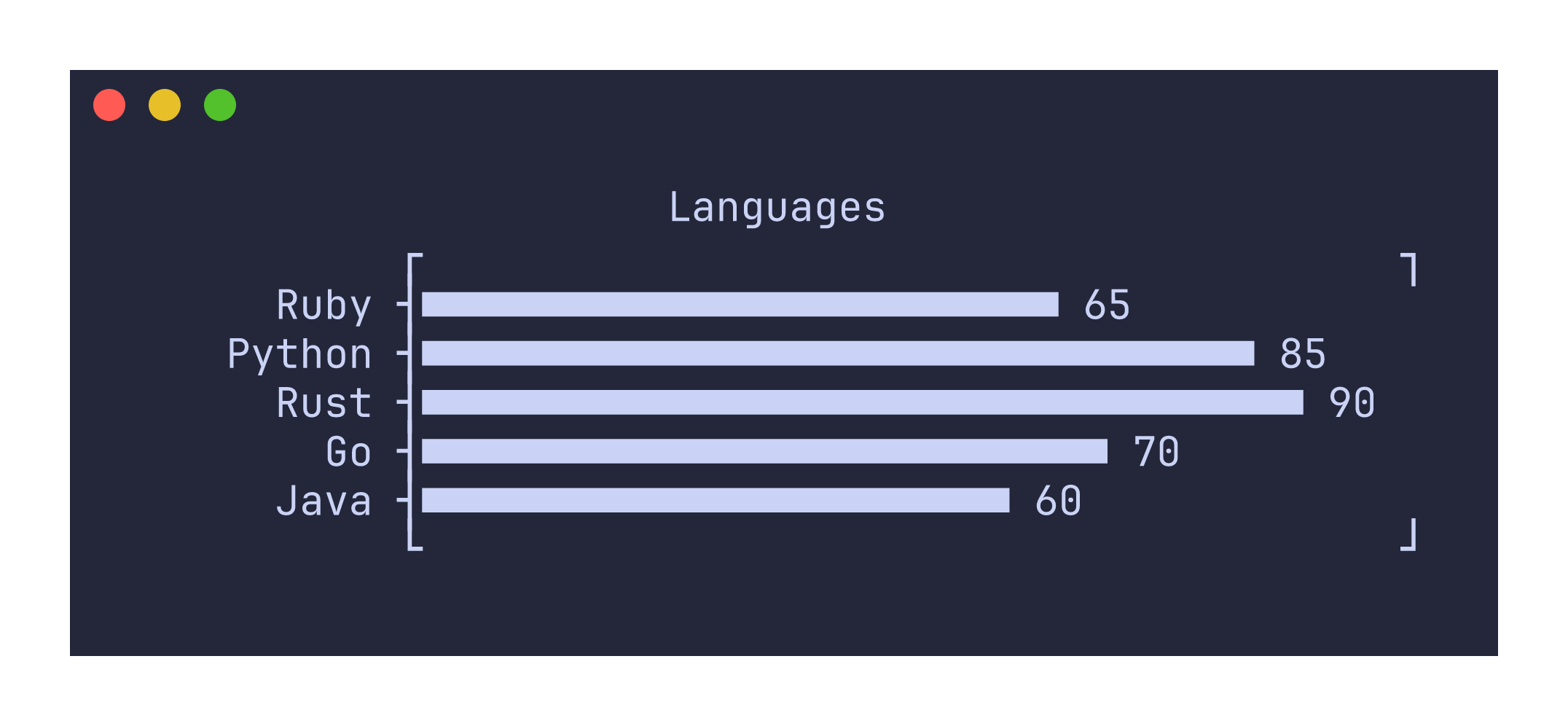
The first column provides the labels and the second column provides the values. The plot appears on stderr by default, so it does not interfere with further pipeline processing.
Plotting numeric sequences
For line plots, you can pipe a single column of numbers and let uplot use the row index as the x-axis:
seq 100 | awk '{print sin($1/10)}' | uplot line
Or provide two columns for explicit x and y values:
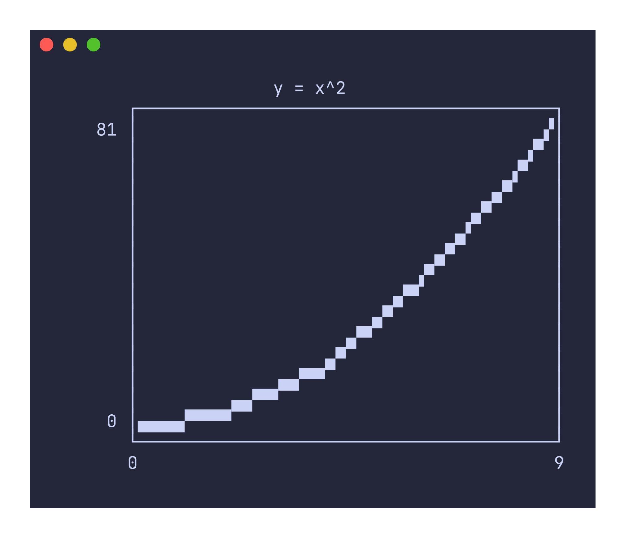
printf "0\t0\n1\t1\n2\t4\n3\t9\n4\t16\n5\t25\n6\t36\n7\t49\n8\t64\n9\t81\n" | uplot line --canvas block -t "y = x^2"
Working with CSV files
Real-world data usually lives in CSV files with headers. Use -H to treat the first row as column headers and -d, to set the delimiter to a comma:
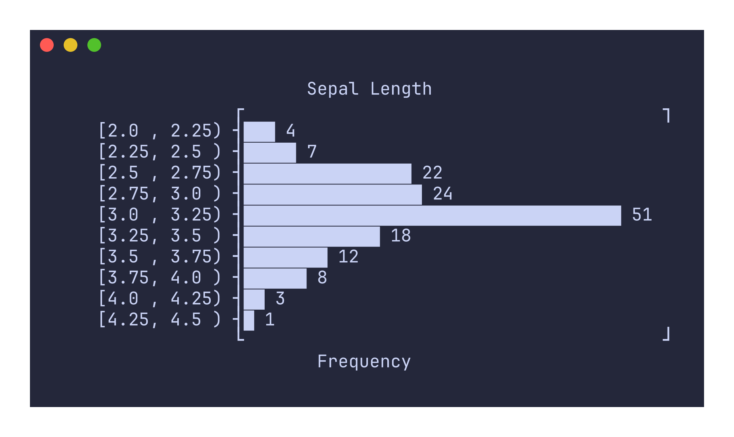
uplot hist -H -d, -t "Sepal Length" < iris.csv
The -H flag tells uplot to use the header row for axis labels and legend names. Without it, the first row would be treated as data.
Choosing a canvas
By default, line plots, scatter plots, and density plots use the braille canvas, which provides the highest resolution (2x4 pixels per character cell). You can switch to other canvas types depending on your font support and aesthetic preferences:
uplot line --canvas block < data.tsv   # 2x2 block elements
uplot line --canvas ascii < data.tsv   # 3x3 ASCII art
uplot line --canvas dot < data.tsv     # simple dot characters
uplot line --canvas density < data.tsv # density shading
The block canvas is a good default if your terminal does not render braille patterns well. The density canvas is specialized for scatter-like data where overlapping points should appear darker.
What next?
The Commands Reference documents each plot type in detail with usage examples and screenshots. The Options Reference covers every flag. The Recipes/Cookbook shows how to combine uplot with common shell tools for practical data analysis workflows.
Commands Reference
uplot provides nine commands, each tailored to a specific type of visualization. Every command reads delimiter-separated data from standard input and renders the plot to stderr by default. Commands share a common set of plot options (title, dimensions, border style, colors, margins) documented in the Options Reference, along with command-specific flags described in each subsection below.
The general invocation pattern is:
<data source> | uplot <command> [options]
or equivalently:
uplot <command> [options] < input-file
Most commands accept aliases for convenience. For example, uplot l is equivalent to uplot line, and uplot s is equivalent to uplot scatter. The full alias list is shown in each command’s section and summarized in the table below.
| Command | Aliases | Input shape | Description |
|---|---|---|---|
bar | barplot | labels + values | Horizontal bar chart |
count | c | single column | Count occurrences and bar chart |
hist | histogram | numeric column(s) | Histogram with automatic binning |
line | lineplot, l | 1-2 numeric columns | Line plot (single series) |
lines | lineplots, ls | multi-column | Line plot (multiple series) |
scatter | s | 2+ numeric columns | Scatter plot |
density | d | 2+ numeric columns | Density plot |
box | boxplot | multi-column | Box-and-whisker plot |
colors | color, colours, colour | none | Show terminal color palette |
The subsections that follow document each command individually with usage syntax, options, examples, and screenshots of typical output.
bar
Aliases: barplot
The bar command renders a horizontal bar chart from labeled numeric data. It expects two-column input where the first column contains labels and the second column contains numeric values.
Usage
uplot bar [options]
uplot barplot [options]
Input format
The default input format is two tab-separated columns: labels in the first column and numeric values in the second. Use -d to change the delimiter.
Ruby	65
Python	85
Rust	90
Go	70
Java	60
Example
printf "Ruby\t65\nPython\t85\nRust\t90\nGo\t70\nJava\t60\n" | uplot bar -t Languages
Command-specific options
| Flag | Description |
|---|---|
--symbol <CHAR> | Use a custom character for bar fill instead of the default ■ |
--xscale <SCALE> | Apply a scale transform to bar lengths: log10 for logarithmic scaling |
The default rendering repeats the ■ character to fill each bar. You can substitute a different character with --symbol, for example --symbol '#' for plain ASCII output. If you use the library API directly and set symbol to None, bars are rendered with fractional Unicode block characters for sub-character-width resolution, but this mode is not exposed through the CLI.
Logarithmic scaling with --xscale log10 transforms bar lengths but preserves the original numeric labels on the axis, so the visual proportions reflect the log scale while the displayed values remain in the original units.
The border style defaults to barplot (which includes tick marks on the left edge) rather than the solid border used by other plot types. You can override this with -b solid or -b corners if you prefer a different frame.
Negative values produce an error rather than being silently clamped. If all values are zero, the chart renders with empty bars.
count
Aliases: c
The count command tallies occurrences of each unique value in a single-column input and renders the result as a horizontal bar chart. It is a convenience command that combines value counting with bar chart rendering in one step.
Usage
uplot count [options]
uplot c [options]
Input format
A single column of categorical values, one per line:
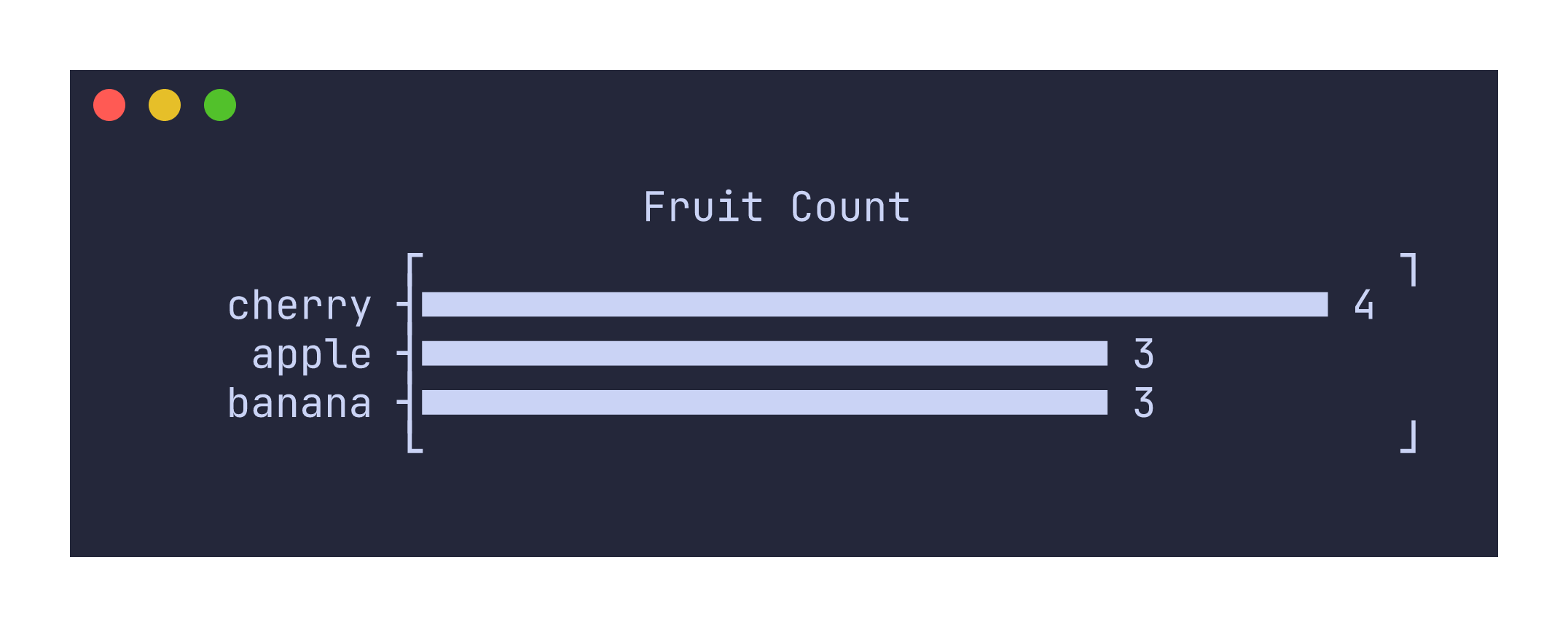
apple
banana
apple
cherry
banana
apple
Example
printf "apple\nbanana\napple\ncherry\nbanana\napple\nbanana\ncherry\ncherry\ncherry\n" | uplot c -t "Fruit Count"
Sorting behavior
By default, values are sorted in descending order by count. When two values have the same count, they are sorted alphabetically. Use -r or --reverse to reverse the sort order so that the least frequent values appear first.
printf "a\nb\na\nc\nb\na\n" | uplot c -r
Command-specific options
| Flag | Description |
|---|---|
--symbol <CHAR> | Custom bar fill character |
--xscale <SCALE> | Scale transform for bar lengths (e.g., log10) |
-r, --reverse | Reverse the sort order (ascending by count) |
The count command reads only the first column of input. If your data has multiple columns, only the first one is used for counting. Headers (-H) are supported and the header value will be used as the plot title if no explicit -t flag is provided.
histogram
Aliases: hist
The histogram command computes a frequency distribution from numeric data and renders it as a horizontal bar chart with interval labels. It automatically determines bin edges and counts values falling into each interval.
Usage
uplot hist [options]
uplot histogram [options]
Input format
A single column of numeric values, or a multi-column dataset where the first numeric column is used:
4.7
5.1
3.8
6.2
5.5
For CSV files with headers, the first numeric column is selected automatically:
uplot hist -H -d, < iris.csv
Example
uplot hist -H -d, -t "Sepal Length" < iris.csv
Binning
The default number of bins is computed using Sturges’ rule: ceil(log2(n) + 1), where n is the number of data points. You can override this with the -n flag:
uplot hist -n 5 -H -d, < iris.csv
Interval closure
By default, intervals are left-closed: [a, b). The last bin is always fully closed [a, b] to include the maximum value. You can switch to right-closed intervals (a, b] with the --closed flag:
uplot hist --closed right -H -d, < iris.csv
Command-specific options
| Flag | Description |
|---|---|
-n, --nbins <N> | Number of bins (default: Sturges’ rule) |
--closed <SIDE> | Interval closure: left (default) or right |
--symbol <CHAR> | Bar fill character (default: \u{2587}) |
The x-axis label defaults to “Frequency”. Interval labels are formatted with aligned decimal precision so that all bin boundaries line up visually, with precision derived from the bin width to avoid unnecessary trailing digits.
line
Aliases: lineplot, l
The line command renders a single-series line plot by connecting consecutive data points with line segments on a Unicode canvas.
Usage
uplot line [options]
uplot lineplot [options]
uplot l [options]
Input format
With a single column, the row index is used as the x-axis and the column values become the y-axis:
0
1
4
9
16
25
With two columns, the first column provides explicit x values and the second provides y values:
0	0
1	1
2	4
3	9
4	16
5	25
Example
printf "0\t0\n1\t1\n2\t4\n3\t9\n4\t16\n5\t25\n6\t36\n7\t49\n8\t64\n9\t81\n" | uplot line --canvas block -t "y = x^2"
Canvas types
The default canvas is braille, which provides the highest resolution at 2x4 pixels per character cell. Other options trade resolution for broader font compatibility:
uplot line --canvas block < data.tsv   # 2x2 block elements
uplot line --canvas ascii < data.tsv   # 3x3 ASCII approximation
uplot line --canvas dot < data.tsv     # simple dot markers
Grid lines
Grid lines are enabled by default, rendering as tick marks at the x=0 and y=0 axes when they fall within the plot bounds. Disable them with --no-grid:
uplot line --no-grid < data.tsv
Axis limits
By default, axis ranges are determined from the data. You can set explicit bounds to zoom in or out:
uplot line --xlim=0,100 --ylim=-1,1 < data.tsv
Command-specific options
| Flag | Description |
|---|---|
--canvas <TYPE> | Canvas type: braille (default), block, ascii, dot, density |
--grid / --no-grid | Toggle grid lines (default: on) |
--xlim <MIN,MAX> | X-axis limits |
--ylim <MIN,MAX> | Y-axis limits |
--fmt <FORMAT> | Data format: xy (default) or yx to swap columns |
When the input has only one column, uplot treats it as y-only data with implicit x values starting at 0. This makes it easy to plot output from commands that produce a single column of numbers, like seq 100 | awk '{print sin($1/10)}' | uplot line.
lines
Aliases: lineplots, ls
The lines command renders multiple series on the same line plot, each in a different color. It is designed for multi-column data where you want to compare several variables side by side.
Usage
uplot lines [options]
uplot lineplots [options]
uplot ls [options]
Input format
The default multi-series format is XYY: the first column provides shared x values and each subsequent column provides a separate y series. With a CSV header row (-H), column names become legend labels:
x,series_a,series_b,series_c
1,10,20,15
2,12,18,17
3,15,22,14
You can switch to XYXY format where columns are paired as x1,y1,x2,y2,… This is useful when each series has its own independent x values.
Example
uplot lines -H -d, --canvas block -t "Iris Measurements" < iris.csv
Colors and legend
Each series is automatically assigned a color from the palette (green, blue, red, magenta, yellow, cyan), cycling if there are more than six series. When headers are provided with -H, each series appears in the legend on the right side of the plot with its column name and color.
Command-specific options
| Flag | Description |
|---|---|
--canvas <TYPE> | Canvas type: braille (default), block, ascii, dot, density |
--grid / --no-grid | Toggle grid lines (default: on) |
--xlim <MIN,MAX> | X-axis limits |
--ylim <MIN,MAX> | Y-axis limits |
--fmt <FORMAT> | Data format: xyy (default, shared x) or xyxy (paired columns) |
The lines command requires at least two columns of data. If only one column is provided, it will return an error suggesting that you use the line command instead.
Non-numeric values in data columns are silently coerced to zero. This means mixed-type CSV files like the Iris dataset (which has a text species column) will not cause errors, but the non-numeric column will appear as a flat line at zero. If that is not useful, use cut to select only the numeric columns you want before piping to uplot.
scatter
Aliases: s
The scatter command renders individual data points on a canvas without connecting them with lines. Each point occupies a single pixel in the chosen canvas resolution, making scatter plots useful for visualizing the distribution and correlation of two variables.
Usage
uplot scatter [options]
uplot s [options]
Input format
Two or more columns of numeric data. The first column provides x values and the second provides y values. With multi-column CSV input and -H, additional columns are plotted as separate series:
uplot s -H -d, < iris.csv
Example
uplot s -H -d, --canvas block -t "Iris Scatter" < iris.csv
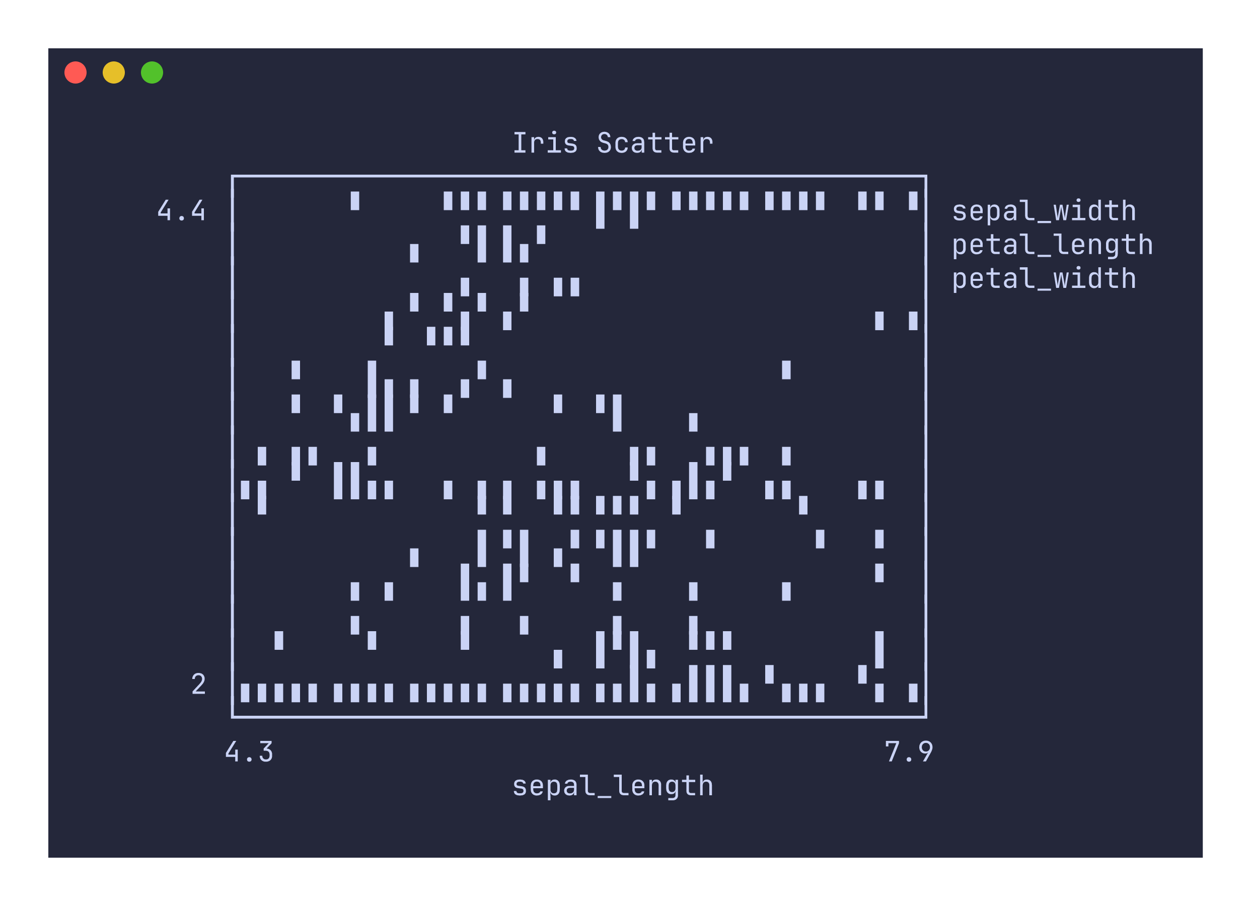
Canvas types
Like line plots, scatter plots default to the braille canvas. The block canvas is a practical alternative when braille glyphs are not available in your font:
uplot s --canvas block -H -d, < iris.csv
The density canvas is also available but is better accessed through the dedicated density command, which forces --no-grid and accumulates hit counts for overlapping points rather than treating each point equally.
Command-specific options
| Flag | Description |
|---|---|
--canvas <TYPE> | Canvas type: braille (default), block, ascii, dot, density |
--grid / --no-grid | Toggle grid lines (default: on) |
--xlim <MIN,MAX> | X-axis limits |
--ylim <MIN,MAX> | Y-axis limits |
--fmt <FORMAT> | Data format: xyy (default, shared x) or xyxy (paired columns) |
The scatter command requires at least two columns. Single-column input will produce an error. For single-column data, use line instead, which can plot y-only data against an implicit x index.
The visual difference between scatter and line is that scatter draws individual points while line connects consecutive points with segments. For the same data, a scatter plot will generally occupy fewer canvas cells than a line plot.
density
Aliases: d
The density command renders a density plot where overlapping points produce darker shading. It uses the specialized density canvas, which counts how many data points land in each character cell and maps the count to a five-level shade gradient: , ░, ▒, ▓, █.
Usage
uplot density [options]
uplot d [options]
Input format
Two or more columns of numeric data. The format follows the same conventions as scatter: the first column provides x values, the second provides y values, and additional columns are plotted as separate series.
uplot d -H -d, < iris.csv
Example
uplot d -H -d, -t "Iris Density" < iris.csv
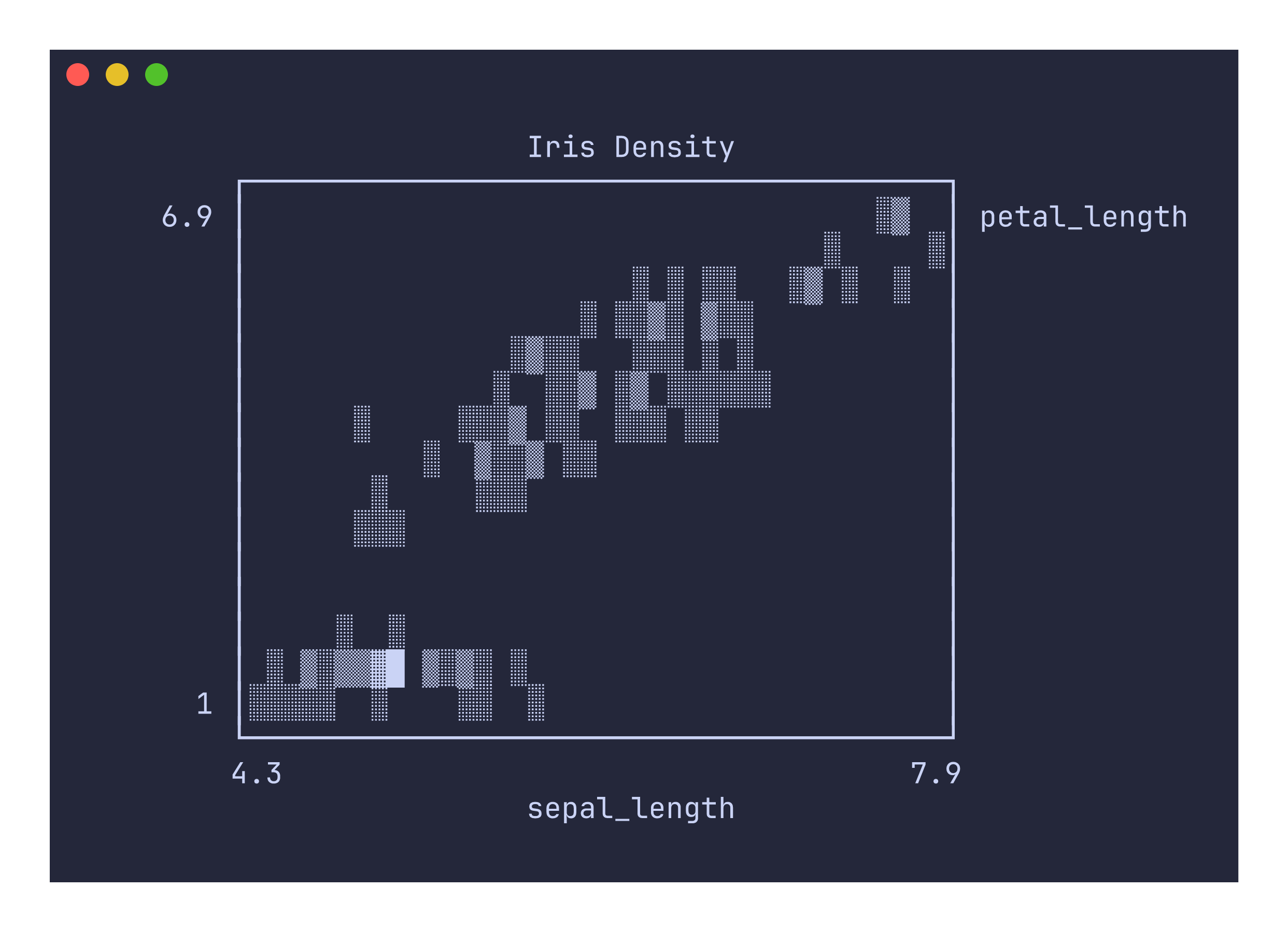
How density shading works
Unlike the scatter command, which places a single dot per point regardless of overlap, the density canvas increments a counter each time a point lands in a cell. After all points have been plotted, each cell’s count is normalized against the maximum count across the entire canvas and mapped to the five shading levels. This means areas with many overlapping points appear dark while sparse areas appear light, making it easy to identify clusters and distribution shape in large datasets.
Command-specific options
| Flag | Description |
|---|---|
--xlim <MIN,MAX> | X-axis limits |
--ylim <MIN,MAX> | Y-axis limits |
--fmt <FORMAT> | Data format: xyy (default, shared x) or xyxy (paired columns) |
The density command always uses the density canvas and always disables grid lines. The --canvas and --grid flags are accepted but ignored.
The density command requires at least two columns. Single-column input will produce an error. Density plots work best with datasets that have enough points to produce visible overlap. With very few points, the output will look similar to a scatter plot since most cells will only contain a single hit.
box
Aliases: boxplot
The box command renders box-and-whisker plots showing the five-number summary (minimum, first quartile, median, third quartile, maximum) for one or more numeric series.
Usage
uplot box [options]
uplot boxplot [options]
Input format
Multi-column numeric data. Each column is treated as a separate series and rendered as its own box. With -H, column headers become the series labels on the left edge of the plot.
uplot box -H -d, < iris.csv
Example
uplot box -H -d, -t "Iris Boxplot" < iris.csv

Reading the plot
Each box is rendered using Unicode box-drawing characters across three character rows:
- Whiskers extend from the minimum to Q1 and from Q3 to the maximum, drawn as thin vertical lines (
╷and╵). - Box spans from Q1 to Q3, drawn with corner pieces (
┌┐└┘) and horizontal fills. - Median is marked with a vertical bar (
┬or┴) inside the box.
The x-axis shows the numeric range, with tick marks at the minimum, midpoint, and maximum values across all displayed series. When multiple series are present, the axis range extends to cover all of them.
Command-specific options
| Flag | Description |
|---|---|
--xlim <MIN,MAX> | Override the automatic x-axis range |
The border style defaults to corners rather than solid, which gives box plots a cleaner appearance by removing the continuous top and bottom border lines.
Non-numeric values in columns are silently coerced to zero. If your CSV has a categorical column mixed with numeric columns (like the species column in iris.csv), the non-numeric column will not cause an error but its box will be collapsed at zero. Use cut to select only the columns you want to plot.
The x-axis range is automatically computed from the data. Use --xlim to override it when you want consistent axis ranges across multiple plots or when you want to zoom into a specific region of the data.
colors
Aliases: color, colours, colour
The colors command displays a reference chart of terminal colors and text attributes. It shows 24 named entries and the full 256-color ANSI palette, each rendered in its own style so you can see exactly how your terminal interprets each code.
Usage
uplot colors
uplot color
Example
uplot colors
Output format
The output is a single line containing all 280 entries (24 named plus 256 indexed), each separated by tabs. Every entry shows the color name or index number rendered in that color, followed by a bullet swatch. The ANSI escape codes are part of the content being displayed, so the output always includes color escapes regardless of the -C and -M flags.
The first 24 entries include the 16 standard and bright ANSI colors (black through light_cyan, plus gray as an alias for light_black) along with 8 ANSI text attribute entries (normal, default, bold, underline, blink, reverse, hidden, nothing). The named colors in this list are the ones accepted by the -c flag when specifying series colors in other commands. The remaining 256 entries (indices 0 through 255) show the extended ANSI palette: 0-7 standard, 8-15 bright, 16-231 a 6x6x6 color cube, and 232-255 a grayscale ramp.
The colors command does not read from stdin, so it can be run without piping any data into it. This makes it a useful diagnostic tool for checking your terminal’s color rendering before plotting.
Options Reference
This chapter documents every flag accepted by uplot, organized by category. All flags listed under “common plot options” apply to every command that renders a plot. Input and output options are global and apply regardless of the command. Command-specific options are listed in the relevant Commands Reference subsections.
Common plot options
These flags control the appearance and layout of the rendered plot. They are available on all plotting commands (bar, count, hist, line, lines, scatter, density, box).
| Flag | Short | Type | Default | Description |
|---|---|---|---|---|
--title | -t | string | none | Plot title, rendered centered and bold above the plot |
--width | -w | integer | 40 | Plot width in character columns (the graphics area, not including borders and margins) |
--height | -h | integer | 15 | Plot height in character rows (for canvas-based plots) |
--border | -b | string | varies | Border style: solid, corners, or barplot |
--margin | -m | integer | 3 | Left margin width in spaces |
--padding | integer | 1 | Padding between the border and the graphics area | |
--color | -c | string | auto | Series color name (e.g., red, blue, green) |
--xlabel | string | none | X-axis label, rendered centered below the plot | |
--ylabel | string | none | Y-axis label, rendered vertically on the left side | |
--labels | flag | on | Show axis value labels (enabled by default) | |
--no-labels | flag | Suppress axis value labels |
Note that -h is used for height, not help. Use --help to display the help text.
Border styles
The four border styles control the frame drawn around the plot area:
soliddraws a complete box with continuous lines on all four sides. This is the default for most plot types.cornersdraws only the four corner pieces, leaving the sides open. This is the default for box plots.barplotis likesolidbut replaces the left side border with tick marks. This is the default for bar charts, count plots, and histograms.asciiuses ASCII characters (+,-,|) instead of Unicode box-drawing glyphs, for terminals with limited Unicode support.
Color specification
The -c flag accepts several color formats:
- Named colors:
black,red,green,yellow,blue,magenta,cyan,white, and their light variants (light_red,light_blue, etc.).grayandgreyare aliases forlight_black. - ANSI 256-color index: a number from 0 to 255 (e.g.,
-c 128). - RGB triple: three comma-separated values from 0 to 255 (e.g.,
-c 255,0,128).
When no color is specified, series colors are assigned automatically from the palette (green, blue, red, magenta, yellow, cyan), cycling for additional series.
Input options
These global flags control how input data is parsed. They apply to all commands that read from stdin.
| Flag | Short | Type | Default | Description |
|---|---|---|---|---|
--delimiter | -d | string | \t (tab) | Column delimiter character |
--transpose | -T | flag | off | Transpose rows and columns before plotting |
--headers | -H | flag | off | Treat the first row (or first column when transposed) as headers |
--encoding | string | UTF-8 | Input character encoding (e.g., UTF-16, Shift_JIS) |
Delimiter
The default delimiter is a tab character. To read comma-separated data, use -d, (no space between the flag and the comma). Any single byte character can be used as a delimiter.
Transpose
The -T flag swaps rows and columns before any other processing. This is useful when your data is arranged with series in rows rather than columns. For example, if you have a file where each row is a named series:
temperature	22	24	23	25	26
humidity	45	50	48	52	55
Use -T to transpose it so that each column becomes a series.
Headers
The -H flag tells uplot to treat the first record as column headers rather than data. Headers are used for axis labels, legend names, and plot titles depending on the command. When combined with -T, the first column of each row is treated as the header for that series.
Encoding
By default, uplot expects UTF-8 input. The --encoding flag allows reading files in other character encodings. The encoding name should be a standard label recognized by the WHATWG Encoding Standard (e.g., UTF-16, Shift_JIS, ISO-8859-1). The input is decoded into UTF-8 before parsing.
Grid plot options
These flags apply to the grid-based commands: line, lines, scatter, and density.
| Flag | Type | Default | Description |
|---|---|---|---|
--canvas <TYPE> | string | braille | Canvas rendering backend: braille, block, ascii, dot, density |
--grid / --no-grid | flag | on | Toggle grid lines at the zero axes |
--xlim <MIN,MAX> | range | auto | Override x-axis range (e.g., --xlim=-1,5) |
--ylim <MIN,MAX> | range | auto | Override y-axis range (e.g., --ylim=0,100) |
--fmt <FORMAT> | string | varies | Data format interpretation: xy, yx, xyy, xyxy |
The --fmt flag controls how multi-column input is interpreted. For single-series commands (line), xy means the first column is x and the second is y, while yx swaps them. For multi-series commands (lines, scatter, density), xyy treats the first column as shared x values with subsequent columns as separate y series, while xyxy pairs columns as x1,y1,x2,y2 so each series has its own independent x values.
Output options
These global flags control where the rendered plot and the raw input data are sent.
| Flag | Short | Type | Default | Description |
|---|---|---|---|---|
--output | -o | optional path | stderr | Route the plot output |
--pass | -O | optional path | silent | Pass raw input through |
--color-output | -C | flag | off | Force colored output regardless of terminal detection |
--monochrome | -M | flag | off | Force plain output with no ANSI escapes |
Plot routing (-o)
By default, the rendered plot is written to stderr. This allows you to pipe data through uplot without the plot interfering with the data stream on stdout.
-o(no value): redirect the plot to stdout instead of stderr-o FILE: write the plot to a file
Data passthrough (-O)
The passthrough flag copies the raw input data to a separate destination, which is useful for tee-like workflows where you want to both visualize and forward data:
-O(no value): copy the raw input to stdout-O FILE: copy the raw input to a file
A common pattern is to render a plot to stderr (the default) while passing the data through to the next pipeline stage:
cat data.tsv | uplot line -O | further-processing
Color mode
The -C and -M flags override the automatic terminal detection. They are mutually exclusive; specifying both produces an error. Without either flag, uplot emits ANSI color codes when the output destination is a terminal and omits them when writing to a file or pipe.
Recipes/Cookbook
This chapter collects practical workflows that combine uplot with common shell tools. Each recipe shows a complete pipeline you can adapt to your own data.
Plotting a CSV file
The most common task is visualizing columns from a CSV file. Use -H for headers and -d, for comma delimiters:
uplot hist -H -d, < data.csv
uplot lines -H -d, < data.csv
uplot box -H -d, < data.csv
For tab-separated files, you can omit the -d flag entirely since tab is the default delimiter:
uplot line < measurements.tsv
Combining with awk and cut
Shell tools like awk and cut are useful for selecting and transforming columns before plotting. For example, to plot only the second and fourth columns of a CSV:
cut -d, -f2,4 data.csv | uplot line -d,
Or to compute a derived value and plot it:
awk -F, '{print $1, $2 * $3}' data.csv | uplot line
You can generate data entirely from shell arithmetic:
seq 100 | awk '{print sin($1/10)}' | uplot line -t "Sine wave"
Multi-series overlay
When your data has a shared x column and multiple y columns, lines overlays all series with automatic color assignment:
uplot lines -H -d, -t "All Variables" < iris.csv
Each column gets its own color and appears in the legend with its header name. To compare specific columns, use cut or awk to select only the ones you want:
cut -d, -f1,2,3 iris.csv | uplot lines -H -d, -t "Sepal vs Petal Length"
Customizing appearance
Combine layout flags to produce a plot tailored to your terminal width and presentation needs:
uplot line -w 60 -h 20 -b corners -m 5 --padding 2 \
    -t "CPU Temperature" --xlabel "Time (s)" --ylabel "Temp (C)" \
    < temperatures.tsv
To use a specific canvas type and disable grid lines for a cleaner look:
uplot scatter --canvas block --no-grid -H -d, < measurements.csv
For histograms, you can control the number of bins and use a custom fill character:
uplot hist -n 20 --symbol '#' -H -d, < data.csv
Using output routing for scripts
In scripted workflows, you often want to both visualize data and pass it along for further processing. The -O flag enables this tee-like behavior:
generate-data | uplot line -O | aggregate-results
Here, the plot appears on stderr (visible in your terminal) while the raw data passes through stdout to the next pipeline stage.
To save a plot to a file for later review while still seeing it on the terminal:
cat data.tsv | uplot line -o plot.txt
This writes the rendered plot (including ANSI color codes by default) to plot.txt. Use -M to strip colors for a plain-text version:
cat data.tsv | uplot line -o plot.txt -M
To save both the plot and the data to separate files:
cat data.tsv | uplot line -o plot.txt -O data-copy.tsv
Counting and sorting categorical data
The count command is useful for quick frequency analysis of log files, command output, or any categorical data:
# Count HTTP status codes from an access log
awk '{print $9}' access.log | uplot c -t "HTTP Status Codes"

# Count file extensions in a directory tree
find . -type f | awk -F. '{print $NF}' | uplot c -t "File Extensions"

# Reverse sort to see least common values first
awk '{print $1}' data.tsv | uplot c -r
Transposed data
When your data is arranged with series in rows rather than columns, use -T to transpose before plotting:
# Input: each row is a named series
# temperature  22  24  23  25  26
# humidity     45  50  48  52  55
uplot lines -T -H < wide-format.tsv
The -T flag swaps rows and columns, and -H uses the first column as series names after transposing.
Encoding conversion
For non-UTF-8 files, specify the encoding directly:
uplot scatter -H -d, --encoding UTF-16 < data-utf16.csv
uplot hist -H -d, --encoding Shift_JIS < japanese-data.csv
The input is decoded to UTF-8 before parsing, so all delimiter and header handling works as expected regardless of the source encoding.
Library Usage
The unicode-plot crate is a standalone Rust library for rendering Unicode terminal plots. You can use it independently in any Rust project without the CLI or DSV parsing layers. This chapter shows how to create common plot types programmatically.
Adding the dependency
Add unicode-plot to your Cargo.toml:
[dependencies]
unicode-plot = "0.1"
Creating a line plot
The simplest way to create a line plot is to provide x and y vectors and use the default options:
use unicode_plot::{lineplot, LineplotOptions};

fn main() {
    let x: Vec<f64> = (0..100).map(|i| f64::from(i) / 10.0).collect();
    let y: Vec<f64> = x.iter().map(|v| v.sin()).collect();

    let plot = lineplot(&x, &y, LineplotOptions::default()).unwrap();

    let mut buf = Vec::new();
    plot.render(&mut buf, true).unwrap();
    print!("{}", String::from_utf8(buf).unwrap());
}
The render method takes any impl Write and a boolean indicating whether to emit ANSI color codes. Pass true for terminal output and false when writing to a file or a context that does not support ANSI escapes.
Customizing plot options
Each plot constructor accepts an options struct for controlling layout and appearance. The fields are concrete types rather than Option wrappers, so you can use struct update syntax with ..Default::default() to override only the fields you care about:
use unicode_plot::{lineplot, LineplotOptions};
use unicode_plot::{CanvasType, BorderType, TermColor, NamedColor};

fn main() {
    let x: Vec<f64> = (0..50).map(|i| f64::from(i)).collect();
    let y: Vec<f64> = x.iter().map(|v| v.sqrt()).collect();

    let opts = LineplotOptions {
        title: Some("Square root".into()),
        xlabel: Some("x".into()),
        ylabel: Some("sqrt(x)".into()),
        width: 60,
        height: 20,
        canvas: CanvasType::Block,
        border: BorderType::Corners,
        color: Some(TermColor::Named(NamedColor::Cyan)),
        name: Some("sqrt".into()),
        ..LineplotOptions::default()
    };

    let plot = lineplot(&x, &y, opts).unwrap();

    let mut buf = Vec::new();
    plot.render(&mut buf, true).unwrap();
    print!("{}", String::from_utf8(buf).unwrap());
}
Creating a bar chart
Bar charts take parallel slices of labels and values:
use unicode_plot::{barplot, BarplotOptions};

fn main() {
    let labels = ["Rust", "Python", "Go", "Java"];
    let values = [95.0, 82.0, 74.0, 68.0];

    let plot = barplot(&labels, &values, BarplotOptions::default()).unwrap();

    let mut buf = Vec::new();
    plot.render(&mut buf, true).unwrap();
    print!("{}", String::from_utf8(buf).unwrap());
}
Creating a scatter plot
Scatter plots use the same options structure as line plots but plot individual points instead of connected segments:
use unicode_plot::{scatterplot, LineplotOptions};

fn main() {
    let x: Vec<f64> = (0..200).map(|i| f64::from(i) / 20.0).collect();
    let y: Vec<f64> = x.iter().map(|v| v.sin() + 0.1 * v).collect();

    let opts = LineplotOptions {
        title: Some("Scatter".into()),
        ..LineplotOptions::default()
    };

    let plot = scatterplot(&x, &y, opts).unwrap();

    let mut buf = Vec::new();
    plot.render(&mut buf, false).unwrap();
    print!("{}", String::from_utf8(buf).unwrap());
}
Creating a histogram
Histograms take a single slice of numeric data and compute bins automatically:
use unicode_plot::{histogram, HistogramOptions};

fn main() {
    let data: Vec<f64> = (0..500)
        .map(|i| ((i as f64) * 0.1).sin() * 3.0 + 5.0)
        .collect();

    let opts = HistogramOptions {
        title: Some("Distribution".into()),
        ..HistogramOptions::default()
    };

    let plot = histogram(&data, opts).unwrap();

    let mut buf = Vec::new();
    plot.render(&mut buf, true).unwrap();
    print!("{}", String::from_utf8(buf).unwrap());
}
Creating a box plot
Box plots accept parallel slices of labels and data series. Each series is a slice of optional string values that are parsed as numbers:
use unicode_plot::{boxplot, BoxplotOptions};

fn main() {
    let labels = ["group_a", "group_b"];
    let series_a: Vec<Option<String>> =
        ["1.0", "2.0", "3.0", "4.0", "5.0"]
            .iter().map(|s| Some(s.to_string())).collect();
    let series_b: Vec<Option<String>> =
        ["2.5", "3.5", "4.5", "5.5", "6.5"]
            .iter().map(|s| Some(s.to_string())).collect();
    let series = [series_a.as_slice(), series_b.as_slice()];

    let plot = boxplot(&labels, &series, BoxplotOptions::default()).unwrap();

    let mut buf = Vec::new();
    plot.render(&mut buf, true).unwrap();
    print!("{}", String::from_utf8(buf).unwrap());
}
The boxplot API takes string values rather than floats because it shares parsing behavior with the CLI layer, which receives all input as text. Each None entry is skipped during summary computation.
Overlaying multiple series
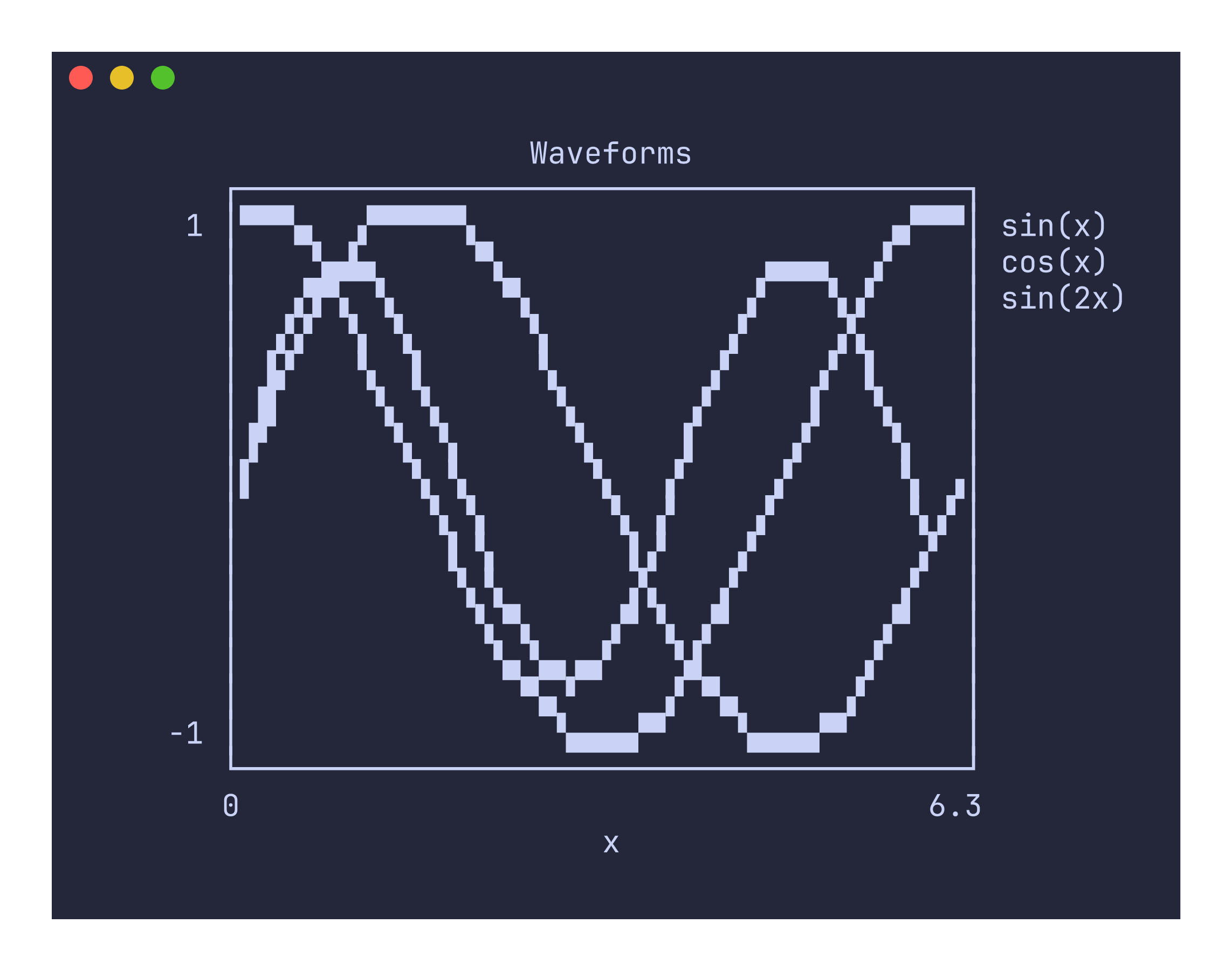
For line plots and scatter plots, you can add additional series to an existing plot:
use unicode_plot::{lineplot, lineplot_add, LineplotOptions, LineplotSeriesOptions};
use unicode_plot::{TermColor, NamedColor};

fn main() {
    let x: Vec<f64> = (0..100).map(|i| f64::from(i) / 10.0).collect();
    let sin_y: Vec<f64> = x.iter().map(|v| v.sin()).collect();
    let cos_y: Vec<f64> = x.iter().map(|v| v.cos()).collect();

    let opts = LineplotOptions {
        title: Some("Trig functions".into()),
        ..LineplotOptions::default()
    };

    let mut plot = lineplot(&x, &sin_y, opts).unwrap();

    let series_opts = LineplotSeriesOptions {
        color: Some(TermColor::Named(NamedColor::Red)),
        name: Some("cos".into()),
    };
    lineplot_add(&mut plot, &x, &cos_y, series_opts).unwrap();

    let mut buf = Vec::new();
    plot.render(&mut buf, true).unwrap();
    print!("{}", String::from_utf8(buf).unwrap());
}
Rendering to different targets
All the examples above render to a Vec<u8> buffer and then convert to a string. You can also write directly to stdout, stderr, a file, or any other impl Write:
use unicode_plot::{lineplot_y, LineplotOptions};
use std::io;

fn main() {
    let y: Vec<f64> = (0..50).map(|i| (f64::from(i) / 5.0).sin()).collect();
    let plot = lineplot_y(&y, LineplotOptions::default()).unwrap();

    let stderr = io::stderr();
    let mut handle = stderr.lock();
    plot.render(&mut handle, true).unwrap();
}
Color mode control
For more fine-grained color control, use render_with_mode which accepts a ColorMode enum:
use unicode_plot::{lineplot_y, LineplotOptions, ColorMode};

fn main() {
    let y: Vec<f64> = (0..50).map(|i| f64::from(i * i)).collect();
    let plot = lineplot_y(&y, LineplotOptions::default()).unwrap();

    let mut buf = Vec::new();
    // ColorMode::Auto checks if the writer is a terminal
    // ColorMode::Always forces ANSI output
    // ColorMode::Never forces plain output
    plot.render_with_mode(&mut buf, ColorMode::Always, false).unwrap();
    print!("{}", String::from_utf8(buf).unwrap());
}
The third argument to render_with_mode indicates whether the writer is a terminal, which matters when the color mode is Auto.
Contributing/Architecture
This chapter is a stub. Contribution guidelines and a detailed architecture map will be added as the project approaches its first public release.
In the meantime, the project README contains a high-level overview of the three-crate workspace structure, and the AGENTS.md file in the repository root documents the development conventions used during initial implementation.