density
Aliases: d
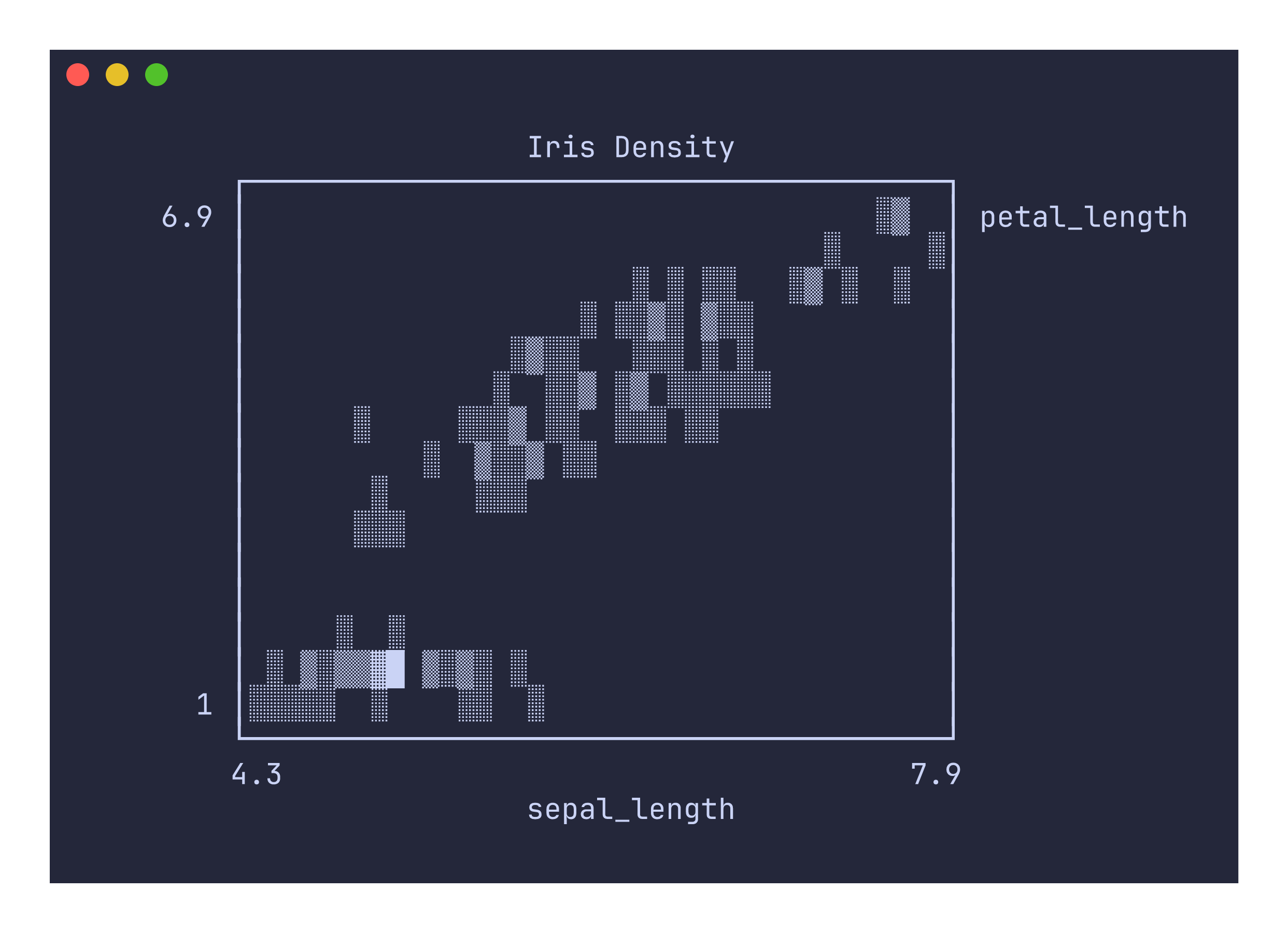
The density command renders a density plot where overlapping points produce darker shading. It uses the specialized density canvas, which counts how many data points land in each character cell and maps the count to a five-level shade gradient: , ░, ▒, ▓, █.
Usage
uplot density [options]
uplot d [options]
Input format
Two or more columns of numeric data. The format follows the same conventions as scatter: the first column provides x values, the second provides y values, and additional columns are plotted as separate series.
uplot d -H -d, < iris.csv
Example
uplot d -H -d, -t "Iris Density" < iris.csv
How density shading works
Unlike the scatter command, which places a single dot per point regardless of overlap, the density canvas increments a counter each time a point lands in a cell. After all points have been plotted, each cell’s count is normalized against the maximum count across the entire canvas and mapped to the five shading levels. This means areas with many overlapping points appear dark while sparse areas appear light, making it easy to identify clusters and distribution shape in large datasets.
Command-specific options
| Flag | Description |
|---|---|
--xlim <MIN,MAX> | X-axis limits |
--ylim <MIN,MAX> | Y-axis limits |
--fmt <FORMAT> | Data format: xyy (default, shared x) or xyxy (paired columns) |
The density command always uses the density canvas and always disables grid lines. The --canvas and --grid flags are accepted but ignored.
The density command requires at least two columns. Single-column input will produce an error. Density plots work best with datasets that have enough points to produce visible overlap. With very few points, the output will look similar to a scatter plot since most cells will only contain a single hit.